


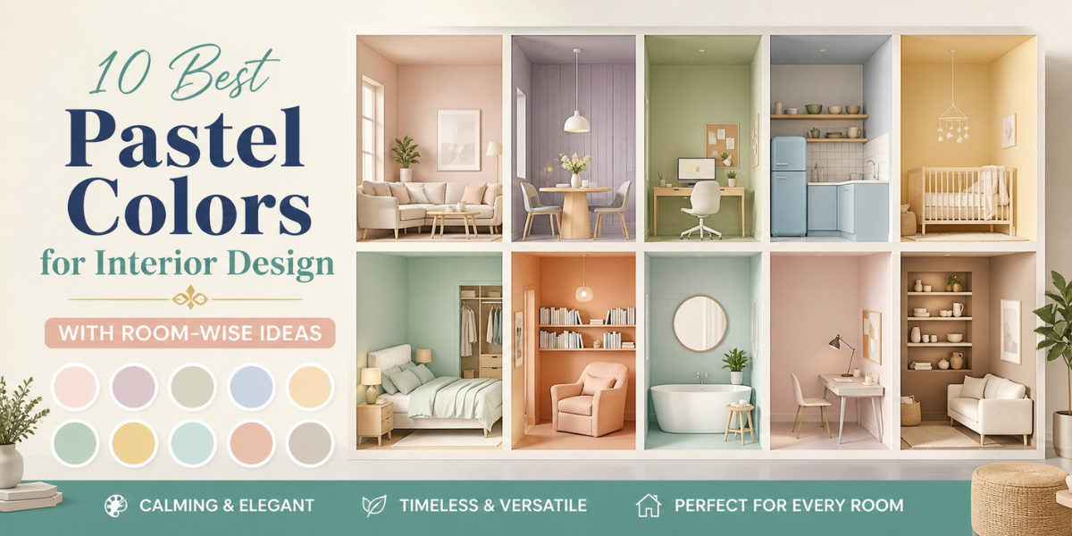
The ten best pastel colours for interior design include lilac, baby blue, blush pink, light butter yellow, mint green, pale peach, creamy beige, light grey, soft coral, and light aqua.
Even though bold colours and jewel tones often take the spotlight, pastels have an elegant, subtle charm that is hard to overlook. Their soft, muted tones bring a sense of ease and openness to any space, which is why they are popular in interior design.
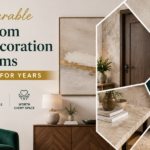
Choosing the perfect pastel wall colour for your home is key to creating a light-filled and serene interior that remains timeless no matter the season in Indian homes.
What Are Pastel Colors?
Pastel colours are a family of muted, pale tones that are created by mixing pure and saturated colours with a high proportion of white. This makes popular colours such as red, blue, orange, and green appear less bright and soft. Some of the best and well-known pastel colours are mint green, lavender, peach, and turquoise.
Why Pastel Colors Are Popular in Interior Design?
Pastel colours are popular in interiors because they create serene and airy environments. Moreover, they have the following benefits:
- Make spaces appear larger and brighter.
- Create a light and refreshing atmosphere, especially during Indian summers.
- Offer versatile styling across different decor styles.
Why Choose Pastels Over Bold Colors?
Choose pastels over bold colours because:
- Soft and Soothing Appeal: Pastel shades create a gentle, relaxed environment that feels easy on the eyes and comfortable for everyday living.
- Spacious and Bright Feel: Pastels are amazing at creating the illusion of space in compact rooms, as well as making rooms appear well-lit.
- Timeless Elegance: Pastels carry a subtle sophistication that remains stylish across changing trends and seasons.
- Versatile: These shades pair with almost anything–furniture, textures, and decor–making them easy to work with.
10 Best Pastel Colors for Interior Design (With Use Cases)
The ten most popular pastels of interior design are:
-
Shades of Lilac
Shades of lilac introduce a creative, spiritual, and meditative energy into a space.
Best Use: Ideal for reading nooks, mediation corners, children’s rooms, or areas dedicated to artistic pursuits.
-
Baby Blue
This shade brings in a light, airy freshness that instantly makes any room feel relaxing.
Best Use: Great choice for bedrooms, bathrooms, or any space meant for unwinding.
-
Blush Pink
Blush pink adds a gentle warmth with a soft, romantic undertone to the walls.
Best Use: Works beautifully in bedrooms, dressing areas, kid’s room, or cosy corners.
-
Light Butter Yellow
This pastel tone introduces a cheerful and uplifting vibe, making your home bright and welcoming.
Best Use: Perfect for kitchens, dining areas, or entryways.
-
Mint Green
Mint green creates a fresh and clean look that offers a naturally soothing presence of the outdoors.
Best Use: Well-suited for bathrooms, kitchens, living rooms, and workspaces.
-
Pale Peach
This softer shade of orange brings a soft warmth and cosy atmosphere to living interiors.
Best Use: Lovely option for living rooms, bedrooms, or dining rooms.
-
Creamy Beige
Creamy beige offers a neutral, grounded base that feels warm and timeless, creating a subtle and elegant backdrop.
Best Use: Ideal for living rooms, hallways, and bedrooms.
-
Soft Coral
Soft corals add just a smidge of vibrancy while still maintaining its muted appearance.
Best Use: Suitable for dining areas, accent walls, or entertainment spaces.
-
Light Grey
The light grey shade introduces an understated look that keeps the space looking modern and uncluttered.
Best Use: Perfect for bedrooms, living rooms, or minimalist interiors.
-
Light Aqua
This shade brings in a cool and refreshing feel that mirrors water-like serenity.
Best Use: Coastal-side homes, bathrooms, and bedrooms. 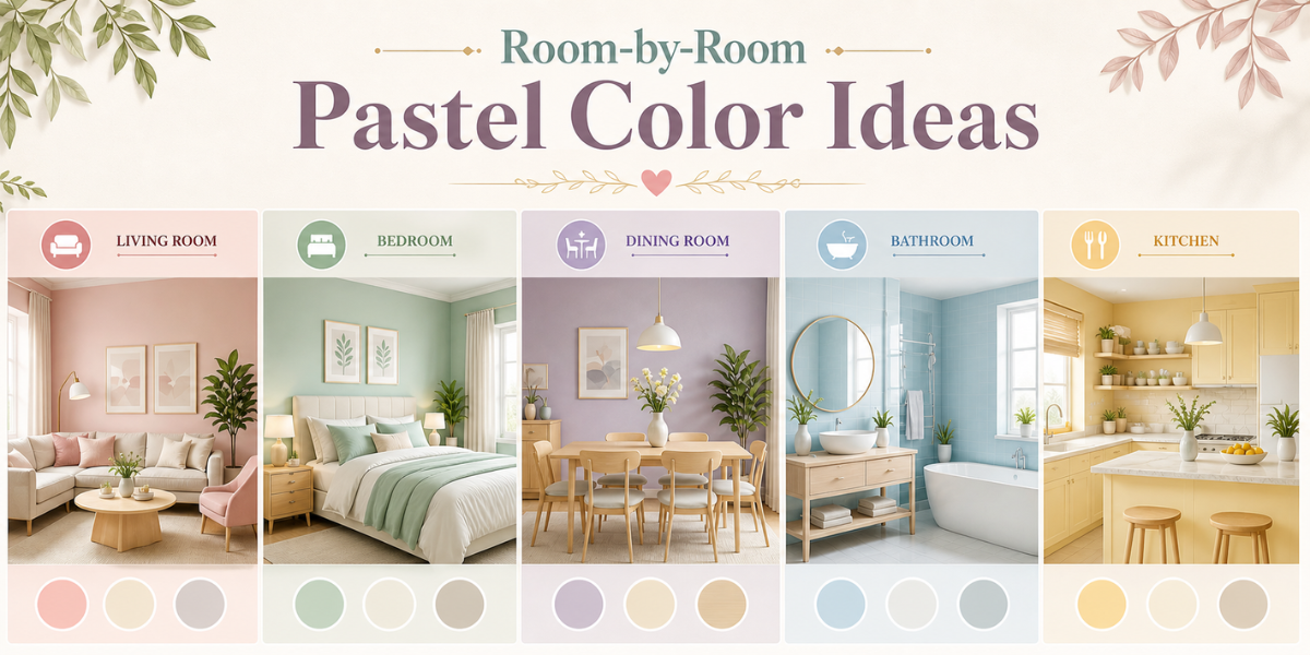
Room-by-Room Pastel Color Ideas
Here are the room-by-room pastel colour suggestions:
-
Living Room
The most favourable pastel colours for the living room are pastel blue, soft beige, blush pink, and sage green. These shades reflect light beautifully, making the space feel welcoming and elegant.
-
Bedroom
The most suitable pastel colours for the bedroom are soft lavender, dusty pink, muted green, and powder blue. These colours promote relaxation and calmness, making it easier to unwind after a long day.
-
Dining Room
Some of the most ideal pastel colours for the dining room are sage green, soft yellow, creamy white, or peach. They add a soft vibrancy to the space that elevates dining experience and conversations.
-
Bathroom
The most sought after pastel colours for the bathroom are aqua blue, mint green, soft grey, or pale lavender, as they bring a clean, refreshing, and spa-like atmosphere.
-
Kitchen
The most preferred pastel colours for the kitchen are butter yellow, baby blue, sage green, and soft, creamy white. These shades pair well with natural light and keep the space looking bright and lively.
Why Pastel Colors Work for Small Spaces
Key reasons why pastel colours benefit compact spaces:
- Visually Expands the Space: Since pastel colours are light and airy, they prevent walls from feeling too close and intimate, giving the illusion of spaciousness.
- Reflects Natural Light: Pastel colours reflect light evenly and beautifully across a compact space, making it appear bright, open, and airy.
- Versatile in Design: Pastels are incredibly versatile in nature, pairing well with a plethora of colours and decor choices.
Best Pastel Color Combinations
If you want to mix and match your pastels, here are some suitable combinations:
-
Pastels and Neutrals
Pairing pastels with whites, beiges, or light grays allows colours to stand out subtly, making the space feel soft and easy on the eyes.
-
Pastels and Metallics
When pastels are paired with metallic accents like gold, brass, or rose gold, they take on a more sophisticated and polished look.
-
Pastel and Bold Accents
Adding bold accents to pastel bases creates contrast and visual interest. Deeper tones like navy, emerald, or burgundy can ground the space and make pastel shades feel more styled.
Top Pastel Wallpaper Designs
Some of Magicdecor’s suitable pastel wallpaper designs are:
-
Floral Pastel Wallpaper
Pastel florals are the most whimsical and romantic wallpaper choice for interiors. From living rooms and bedrooms to hallways and dining areas, they bring in a gentle charm.
-
Geometric Pastel Designs
Geometric patterns in pastel tones create a balanced mix of softness and structure, working well in contemporary spaces like living rooms or work areas.
-
Watercolour-Effect Patterns
Watercolour styles of botanical prints or landscapes create a dreamy, diffused look with gentle colour transitions, perfect for bedrooms and creative spaces.
-
Abstract Pastel Patterns
If you want to introduce a creative and free-flowing look, opt for abstract designs in pastel tones. They are a great choice for accent walls as they add a unique visual focal point.
-
Vintage Pastel Designs
Vintage-inspired pastel designs such as damask, chinoiserie, and retro add a touch of vintage nostalgia to interiors. They create a cosy and inviting atmosphere with a hint of old-world glamour.
How to Choose the Right Pastel Shade
You can choose the right pastel shade by following these steps:
-
Evaluate Room Size
Pastel colours are often used to visually expand small or compact rooms, as their light tones reflect more light and make spaces feel more open and less confined.
-
Consider Room Lighting
Even in low-light rooms, pastel shades can help create an illusion of brightness by reflecting available light, making the space feel softer and more illuminated.
-
Understand the Mood You Want to Create
Pastel colours carry subtle emotional cues like soft pins can feel romantic, pastel yellows bring a sense of optimism, while blues and greens provide relaxation. Based on your desired mood, you can choose a pastel colour for your walls.
-
Coordinate with Existing Decor
Ensure the pastel shade complements your furniture, curtains, and finishes so the overall look feels cohesive, harmonious, and visually pleasing to look at.
How to Style Pastel Walls with Furniture
Here’s how to style pastel walls with various furniture and decor:
- Light Wood Tones: Keeps the room airy and looks Scandinavian-inspired.
- Dark Wood Tones: If you need to add contrast, dark wood furniture offers depth.
- Neutral Upholstery: For a more minimalist look, pair pastel walls with neutral furniture like beige, white, or soft grey.
- Rattan and Cane: If you own a rattan or cane furniture piece, pastel walls create a breezy and summery aesthetic.
- Metal Accents: Metallic finishes like brass decor or gold fixtures give interiors a modern edge.
Best Finishes for Pastel Walls & Wallpapers
Pastel wallpapers look best in the following wallpaper finishes:
- Matte Finishes: Matte finishes give pastels a soft, muted look that feels smooth and non-reflective, perfect in rooms where an understated effect is preferred.
- Glossy Finishes: Glossy finishes reflect light, making pastel shades appear brighter and more vibrant, perfect in low-light spaces.
- Textured Finishes: Textured finishes like embossed offer depth and dimension to the walls, offering both a tactile and visual appeal.
Common Mistakes to Avoid
Here are some common pitfalls you should avoid:
- Not using pastel-coloured wallpapers in low-light or compact spaces.
- Choosing the wrong finish for the room, especially in a low-light room.
- Overdoing bold accents that overpower the softness of pastels.
- Cluttering the space, which takes away the airy feel.
What Works Best for Indian Homes?
The following aspects work best for Indian homes:
- Opt for washable and durable materials like vinyl to handle dust, humidity, and daily wear.
- Choose light but warm pastel tones that complement Indian seasons and lighting conditions.
- Pair pastels with wooden or traditional elements.
- Pair with natural fabrics like cotton and linen for a climate-friendly feel.
How Magicdecor Helps You Use Pastels Beautifully
We help you style pastel wallpapers beautifully in your home by offering:
- A wide range of pastel designs that suit different styles and spaces.
- Crafting them on premium 250-350 GSM paper for a rich, durable finish.
- Printing using non-toxic, VOC-free inks for a safer indoor air quality.
- Designed to suit modern and traditional Indian homes.
Pastel Color Checklist
- Choose pastel shades that suit your room size and lighting.
- Stick to a limited pastel palette to avoid visual clutter.
- Add one to two bold accents for depth and contrast.
- Pair with light or natural materials like wood, linen, or cane.
- Select the right finish (matte, glossy, or textured) for the space.
- Ensure colours complement your existing furniture and decor.
- Test samples before finalising the shade.
FAQs
- What are the best pastel colours for interior design?
The most popular and favoured pastel wall colours are baby blue, blush pink, lilac, creamy beige, butter yellow, muted greens, and light grey.
- Can pastel colours make my room bigger?
Yes, since pastels have a high amount of whites in them, they can reflect more light, creating the optical illusion of spaciousness.
- Can pastel colours be combined?
Yes, you can combine two to three pastel colours in a room, provided they share similar undertones and are balanced using the 60-30-10 rule.
- Which wallpaper finish works best for pastel colours?
Matte finishes are ideal for a soft look, while glossy or textured finishes can be used to enhance brightness and add dimension.


 Material Preview
 Digital Snapshot
 Design Selection
