







Delivery by
22, Aug to
400604
Choose your location
Standard Delivery by 26, Aug
to 400604
Priority Delivery by
24, Aug
to 400604
Disclaimer: The estimated delivery dates are based on standard design approval time of under 24hours. Any additional time in design proof approval will increase the estimated delivery dates mentioned above.
or Sign in to see your addresses* Shipping available for all cities in India. Priority shipping can be availed at Rs. 1699.
Installation services are limited to major metro cities in India. For installation feasibility and charges please contact our sales team or check feasibility on the checkout page.
Fandango Color
A bold and elegant magenta-purple shade that brings creativity, luxury, and modern sophistication to interior spaces.
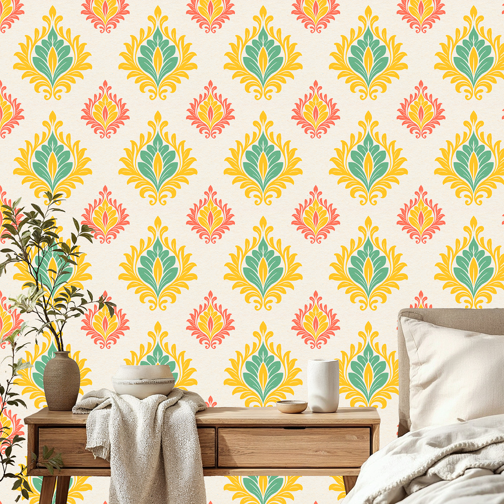
What is Fandango Color?
Fandango (#B53389) is a rich reddish-purple color that combines the energy of pink with the depth of purple. Known for its vibrant and expressive character, it is often used in interior design to create statement walls, stylish wallpapers, and luxurious decorative accents. Its unique balance of warmth and sophistication makes it suitable for both modern and classic spaces.
| HEX | #B53389 |
| RGB | 181, 51, 137 |
| CMYK | 0, 72, 24, 29 |
| HSL | 320°, 56%, 45% |
| Category | Warm / Earthy Tone |
Need help in deciding on a color theme for your walls?
Talk to our experts.
Fandango Color Meaning Psychology
Fandango is a vibrant reddish-purple shade that symbolizes creativity, confidence, individuality, and sophistication. Its energetic blend of pink and purple creates a bold yet elegant personality, making it a color often associated with artistic expression, luxury, and modern style.
The rich character of Fandango brings excitement and visual interest to interiors while maintaining a refined appearance. It can make spaces feel more dynamic, stylish, and inviting without appearing overly dramatic.
Fandango in Interior Design
Fandango is an excellent choice for creating statement interiors that feel contemporary and expressive. Whether used in wallpaper, accent walls, upholstery, or decorative accessories, it introduces depth and personality into a room.
This color pairs beautifully with metallic finishes, soft neutrals, and rich jewel tones. Fandango works particularly well in glamorous, eclectic, modern, and boutique-inspired interiors where color plays a key role in the overall design.
Shade Variations of Fandango
Soft Fandango: A lighter and more delicate variation with subtle pink undertones.
Berry Pink: A vibrant shade that feels playful and energetic.
Orchid Purple: A floral-inspired variation with stronger purple notes.
Mulberry: A deeper tone that adds richness and elegance.
Plum Magenta: A dark luxurious shade ideal for sophisticated interiors.
Best Color Combinations for Fandango
Champagne Gold: Enhances the luxurious and glamorous appeal of Fandango.
Soft Blush Pink: Creates a romantic and harmonious color palette.
Charcoal Gray: Provides modern contrast while balancing the vibrancy of the shade.
Emerald Green: Creates a rich jewel-toned combination full of elegance and character.
Cream White: Softens the intensity and keeps interiors bright and balanced.
Deep Navy Blue: Adds sophistication and dramatic contrast.
Where Fandango Works Best
Bedroom: Creates a stylish and luxurious retreat.
Living Room: Adds personality and acts as an eye-catching focal point.
Dressing Room: Enhances glamour and elegance.
Boutique Spaces: Creates a memorable and sophisticated atmosphere.
Accent Walls: Introduces bold color without overwhelming the room.
Styling Tips for Fandango Interiors
- Pair with gold or brass accents for a luxurious finish.
- Use velvet fabrics to enhance its rich appearance.
- Balance the boldness with soft neutral furnishings.
- Incorporate mirrors to reflect light and brighten the space.
- Combine with marble textures for a refined contemporary look.
Design Styles That Complement Fandango
- Glamorous
- Modern Luxury
- Art Deco
- Eclectic
- Contemporary
- Boutique Style
How Fandango Looks in Different Lighting
Natural Light: Appears vibrant and balanced with visible pink-purple undertones.
Warm Lighting: Highlights its magenta tones and creates a cozy ambiance.
Cool Lighting: Brings out richer purple notes for a sophisticated appearance.
Evening Light: Creates a dramatic and luxurious atmosphere.
Trending Fandango Color Wallpapers
Explore the best Fandango Color wallpapers for your home. From classic designs to modern patterns


FAQs
What is the meaning of Fandango color?
Fandango represents creativity, confidence, individuality, elegance, and artistic expression. It is often associated with luxury and contemporary style.
Is Fandango a warm or cool color?
Fandango is generally considered a warm-toned purple due to its strong pink and magenta undertones.
Which colors go best with Fandango?
Champagne Gold, Soft Blush Pink, Charcoal Gray, Emerald Green, Cream White, and Deep Navy Blue are among the best color pairings for Fandango interiors.
Is Fandango suitable for small rooms and for big rooms as well?
Yes. In smaller rooms, it works best as an accent color, while in larger spaces it can be used more extensively to create a bold and luxurious environment.
What wallpapers are available in Fandango shades?
Fandango looks stunning in floral wallpapers, Art Deco patterns, geometric designs, abstract murals, luxury textured wallpapers, and contemporary statement wall coverings.
Create Your Perfect Space With Fandango Wallpapers
Discover custom-sized, eco-friendly wallpapers in elegant Fandango tones. Printed with VOC-free inks and backed by a 3-year color warranty.
Shop Fandango Wallpaper
Phone Verification
4:59
Home Consultation
For Wallpapers & Blinds
 Material Preview
 Digital Snapshot
 Design Selection

Enter your details to claim this offer: