


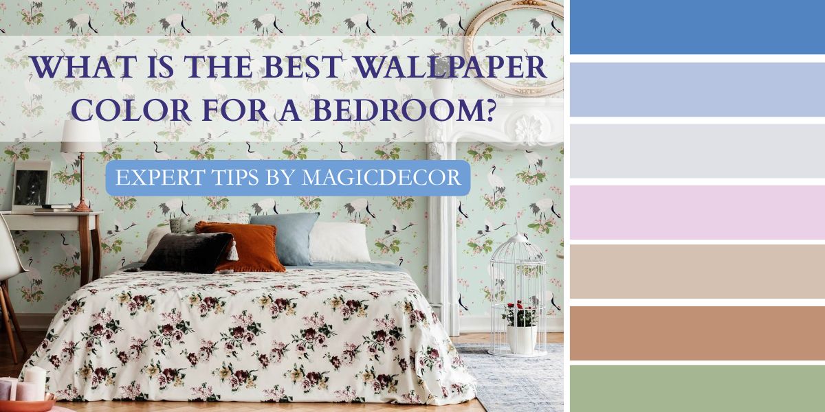
We spend a surprising amount of our lives in the bedroom. It’s where our days begin and end, where we slow down, recharge, scroll on our phone, think, rest, and sometimes do absolutely nothing.
Over time, this room starts to feel personal, almost like an extension of ourselves. And every element in it– from the furniture and bedding to the wall color– shapes how we feel in it.
Wallpaper color, in particular, plays a role in setting the mood, comfort, and appearance of the bedroom. Choosing the right color shouldn’t only be about the looks, it should also fit perfectly with the room and your everyday life.
Therefore, since Magicdecor is a customized home decor brand offering eco-friendly, VOC-free wallpapers and wall murals with bespoke and made-to-measure designs tailored to each space, the experts here will breakdown the process of choosing the right color by sharing tips, steps, and practical insights.
Why Wall Color Matters in the Bedroom?
The bedroom is everything for us. It’s where we sleep, unwind after long days, spend quiet moments with ourselves, and often pursue little habits and hobbies that bring comfort. Because we spend so much meaningful time here, the wall color shapes how the space feels.
Wall color in the bedroom matters because:
- It Directly Affects Sleep Quality and Relaxation: Wall colors influence how the mind responds to a space. Softer or comforting shades make it easier to relax and fall asleep.
- It changes How Big or Comfortable the Bedroom Feels: Lighter tones reflect light and make bedrooms feel open and breathable, while darker shades add depth and intimacy. Thus, playing a role in visual perception.
- It Influences Mood and Emotional Comfort: Since we spend a lot of time in the bedroom, the wall colors quietly affect our emotions and mood. When chosen well, the bedroom feels like a place you genuinely want to return to.

Which Colors Interior Experts at Magicdecor “Recommend” for Bedroom Wallpaper Colors
Choosing a bedroom wallpaper color directly influences our mood, comfort, and how the space feels over time. Interior experts at Magicdecor recommend these bedroom wallpaper colors for their timeless appeal and ability to create a restful space:
- Soft Neutrals with Subtle Textures: Wallpapers in ivory, beige, or greige paired with watercolor visuals or minimal geometric patterns.

- Muted Blues with Delicate Motifs: Dusty or baby blues work beautifully with fine stripes, abstract washes, or subtle botanical motifs.

- Sage and Olive Greens with Organic Designs: Nature-inspired greens paired with leaf motifs, soft florals, or landscapes.

- Dusty Rose with Elegant Prints: This tone pairs well with delicate, romantic florals, marble-effect, or art-inspired patterns.

- Warm Greys with Geometric Designs: Warm grey wallpapers featuring subtle geometric patterns like quatrefoil, diamonds, or chevrons.

Wallpaper Colors Magicdecor Experts Recommend to “Avoid” in Bedrooms
Since 2020, Magicdecor has been helping homeowners personalize their spaces through custom wallpapers and wall murals. From this hands-on experience, we’ve learned that while there are no strict right or wrong colors—because a bedroom should always feel deeply personal—certain colors can negatively affect mood and sleep quality. Based on our expertise, here are the bedroom colors Magicdecor recommends avoiding, along with the reasons why:
1. Bright Red
Red is by far the most common color to avoid in the bedroom. Why so? Because it is the most stimulating and invigorating color that is too intense for a place meant to sleep and rest.
2. Bright Pinks
Bright pink is another color to avoid in the bedroom as it overstimulates and does not help you wind down due to its high saturation. However, a baby pink shade is encouraged to help relax and sleep.
3. Black
On the contrary to red and bright pinks, black should be avoided due to its gloomy mood. No doubt some dark colors can be cozy but true black feels oppressive and ‘sucks the life out of the room’, thus negatively impacting your mood.
4. Neon Blue
Blue is said to be the calmest shade and helps promote relaxation and sleep in the bedroom. However, an electric, neon blue is too cold and stimulating to have on the bedroom walls, leading to an overactive mind.
5. Deep Purple
Dark, intense purple shades are suitable for any other rooms in the house save for the bedroom. The color tends to make rooms feel smaller and in some cases, frightening and ‘nightmarish’.
6. Acidic Green
Green is no doubt a good color for the bedroom, but acidic greens like lime green are stimulating and high-energy that will prevent your mind from settling or relaxing for the night.
Bedroom Colors That Promote Better Sleep
Here are some of the best bedroom colors that will change how you sleep:
1. Soft Blue
There is no perfect shade for your bedroom than baby blue as it is known for its soothing and relaxing properties. Even studies prove that choosing baby blue in your bedroom helps you receive a restful sleep.

2. Warm Neutrals
Colors like beige, off white, cream, and grey create the perfect cozy and grounded atmosphere in your personal sanctuary. Moreover, neutral shades make the bedroom feel lighter and more airy, perfect for winding down.

3. Sage Green
Shades of green such as pista or sage create a sense of tranquillity and balance. Besides this, the color reminds us of nature and therefore soothes our eyes and helps reduce stress and fatigue.

4. Lavender
Lavender or light purple are known for their calming effects, helping reduce anxiety and promote a restful sleep. The soft, soothing shades of this color creates an elegant and cool atmosphere in the room.

5. Light Pink or Blush
Just like lavender, light pink creates a calming and romantic atmosphere in the bedroom as the pastel tone makes the space feel lighter and modern. It’s the ideal color to create an inviting and restful ambience.

Best Wallpaper Designs and Patterns for Bedrooms
1. Classic Geometric Shapes
Geometric patterns make one of the best and versatile wallpaper designs for the bedroom. The repeating motifs of chevrons, quatrefoil, herringbone, etc bring balance and structure to the room while also keeping it elegant.

2. Watercolor Landscapes
For a more sophisticated and artistic touch in your bedroom, watercolor landscapes make the perfect accent wall. Wake up to misty mountains and rolling meadows that feel rejuvenating and soothing.

3. Chinoiserie
Chinoiserie is the epitome of a timeless wall decor. Homeowners choose to style this design in their bedroom because it adds elegance, enchantment, and timeless artistry to the room that needs it most.

4. Floral Prints
Floral prints make the perfect wallpaper design for a bedroom as it’s not only vintage, it creates a floral sanctuary, taking away everyday stress and replacing it with natural harmony.

Bedroom Wall Color Combinations for Your Home
The right color combination can instantly elevate your bedroom, making it look cohesive and uniquely yours. Here are some suggested wall color combinations to try:
- White and Soft Grey: White is clean and airy while soft grey adds a tinge of contrast, turning the space modern.
- Beige and Warm Brown: Both beige and brown are cosy and inviting colors that exude warmth and welcome when paired together.
- Dusty Blue and Crisp White: Both pairs are light and airy, making them suitable for rooms where relaxation and calmness are foremost.
- Sage Green and Cream: The deep contrast of sage green to cream makes it a natural, soothing, and well-balanced color combination for bedrooms.
Choosing Wallpaper Colors Based on Bedroom Size and Light
Here’s how to choose wallpaper colors based on your room size and lighting:
1. Small Bedrooms
In small bedrooms, light colors such as pale greys, warm beiges, blush, or sage reflect light and make the walls feel farther away, thus, giving the illusion of space. Avoid dark, heavy colors that visually shrink an already small room.

2. Large Bedrooms
Large bedrooms can handle depth and drama, so this where richer colors can really shine. Deep blues, forest greens, and terracotta can make your room feel cosy rather than cavernous. Avoid pale or flat colors that can make an expansive room feel empty.

3. High Natural Light
If a bedroom gets plenty of natural light, it amplifies the color on the wallpaper. Bright sunlight can wash out very pale shades or make warm colors feel overly intense. Instead, pick cooler tones like blues, greens, or soft greys to balance the brightness beautifully.

4. Low Natural Light
If your bedroom receives a moderate or less amount of light, colors that add warmth and brightness are more beneficial. Warm neutrals like taupe, creamy whites, or icy blues prevent the space from feeling gloomy.
Matching Wallpaper Color with Bedroom Style
If you already have a bedroom style established, here are some wallpaper shades that naturally align with the aesthetic:
1. Modern and Minimalist Bedrooms
If your bedroom vibe is modern and minimalist, choose wallpapers with soft greys, warm creams, muted taupes, and light beige, along with minimal geometric motifs that enhance the space without drawing too much attention.
2. Bohemian and Eclectic Bedrooms
If you have a bohemian or an eclectic space, wallpapers with expressive, earthy, and artistic colors and patterns are the most suitable choice. Go for warm terracotta, olive green, or muted mustard with abstract shapes to complement the style.
3. Classic and Traditional Bedrooms
If your bedroom is traditional, classic, or cultural, feature wallpapers with warm beiges or soft creams along with floral prints, damask, or Indian artistic motifs to help maintain a historical yet elegant atmosphere.
4. Luxury and Hotel-Style Bedrooms
Wallpaper colors for a hotel-style bedroom would be deep blues, emerald green, or charcoal grey to exude a high-end and dramatic look. Patterns such as Art Deco or damask maintain the sophistical feel in the room.
How to Choose the Best Bedroom Wallpaper Color in 5 Steps:
Here are five simple steps recommended by Magicdecor experts to help you make a bedroom color choice you’ll love in the long run:
1. Start with the Size of Your Bedroom
Before you even think about trends or patterns, look at the size of your bedroom. Smaller rooms benefit from lighter, softer shades that create the illusion of space, while larger bedrooms can comfortably handle rich and bold colors.
2. Observe the Natural Light Throughout the Day
Light changes everything. A wallpaper color that looks great in the afternoon sun might look dull at night. The experts recommend you observe how much natural light your bedroom receives and accordingly choose a color.
Bright rooms can handle warmer shades as they balance out the brightness of the sun. Low-lit rooms on the other hand need lighter shades to avoid turning the room gloomy.
3. Decide the Mood You Want to Create
Your bedroom should reflect the ambience and mood you want to feel when you’re spending time in it. If you want the mood to be cosy and moody, pick deeper tones. If you want calm and restful, go for soft blues and warm neutrals.
This helps give your room the ambience you truly desire while also narrowing down colors.
4. Consider Your Existing Furniture and Decor Style
Wallpaper shouldn’t compete with your furniture and decor style, but rather complement them. To help all the colors exist naturally, note down which are the dominant colors present in the room.
Accordingly, pair wooden furniture with earthy-toned wallpapers and modern furniture with cool-toned wallpapers. This step will ensure the final look feels cohesive.
5.Test Before You Commit
Even expert-approved choices deserve a real-world test. Order samples and view them in your room’s lighting on your actual wall to help you determine whether the color is the right choice or not. Besides, this helps prevent costly mistakes and gives you confidence in your final choice.
Common Mistakes to Avoid When Choosing Bedroom Wallpaper Color
According to Magicdecor experts, these are the most common mistakes homeowners make when choosing bedroom colors and why you should avoid them too:
1. Choosing a Color Based on a Trend
Trendy colors can be appealing for a short period of time and may not translate well into everyday living in an Indian household. Bedroom wallpaper is a long-term decision and going with trendy colors may lose its charm over time.
2. Ignoring Room Lighting
Lighting plays a major role in how wallpaper color appears in your room. Natural and artificial light can change the tone, warmth, and depth of the wallpaper which is why you must consider it before picking a color.
3. Going Too Bold in an Already Busy Space
Bold and heavy-patterned wallpapers need expansive wall space to visually breathe. When paired with heavy furniture and layered textures, it can overwhelm the space. Instead of looking stunning, the bedroom may start to feel visually exhausting.
4. Choosing a Color That Fights the Room’s Mood
Bedrooms are meant to feel restful, yet many wallpaper choices prioritise style over comfort. Choosing colors that are too vibrant or high-contrast can disrupt the calm atmosphere the bedroom needs.
Best Bedroom Wallpaper Colors for Indian Homes & Climate
Indian homes experience a plethora of climates— strong sunlight during the summers, moisture-laden winds during monsoon, and dry, cold winters. These diverse climates make wallpaper color selection especially important.
- Warm Neutrals with Soft Textures: Choose shades like cream, beige, or light sand paired with subtle textures like brushstrokes, grasscloth, or marble to keep the bedrooms cool-looking.
- Earthy Greens with Organic Patterns: Sage, olive, and muted green wallpapers are trendy and work well in Indian climates by creating a fresh and green ambience in warmer regions.
- Soft Blues with Minimal Designs: If your home is near the coastal side or somewhere with loads of sunlight, powder blue or dusty blue shades are ideal.
- Terracotta with Abstract Shapes: Inspired by Indian landscapes, this shade with Indian cultural motifs or abstract shapes work well in well-ventilated rooms for an airy, grounded vibe.
Making the Right Wallpaper Color Choice for Your Bedroom
To answer the title question, the best wallpaper color for your bedroom is the one that fits your space, your light, and the way you live in it. Bedrooms are our personal space shaped by routine, habits, mood, and comfort, and therefore, there isn’t such a thing as a ‘perfect’ color.
By paying attention to the tips, process, and insights suggested by Magicdecor’s experts, you will be successful in choosing the right wallpaper color for your bedroom– one that feels good to home to every single day.

FAQs
- What is the best wallpaper color for a bedroom?
The best wallpaper color for a bedroom depends on various factors like room size, lighting of the room, the mood you want to create, and your personal preferences. Shades like soft blues, earthy greens, and neutrals are widely preferred in bedrooms.
- Should bedroom wallpaper be light or dark?
Both can work but it also depends on the size of the room. Light colors are ideal for smaller bedrooms or rooms with limited natural light, as they make the space feel open. Darker shades work best in larger bedrooms where they add a cosy and intimate feel.
- Should I wallpaper all walls or just one?
Both options work, depending on the bedroom’s size and design. Wallpapering all four walls creates an immersive look and works best with subtle patterns and soft colors. A single feature wall behind the bed is also ideal if you’re using a dark shade and bold patterns.
- Are Magicdecor’s wallpapers safe for children’s bedrooms?
Absolutely! Our wallpapers are safe for children’s bedrooms as they are made using non-toxic materials. Our water-based and VOC-free inks release no toxins and do not affect the indoor air quality.


 Material Preview
 Digital Snapshot
 Design Selection
