


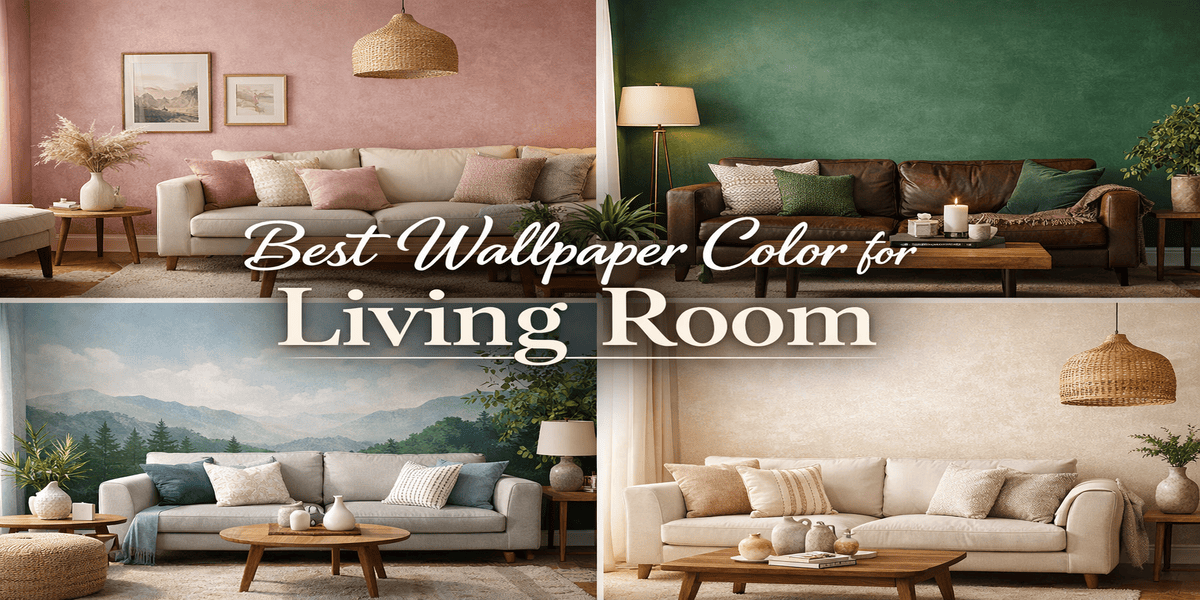
If you’re trying to determine the best wallpaper color for your living room, here are some favourable options:
- Neutral colors like beige, cream, and grey that are timeless and versatile.
- Dark colors like green and dark blue that create an intimate and cosy feel.
- Light pastels like dusty pink and lavender that create a sense of openness.
Beside this, the most suitable wallpaper color depends on room size, lighting, and interior style.
Selecting a wall color for the living room is a very difficult task. It is, afterall, the main gathering space in your home, one where guests are welcomed and family spend time together. Therefore, the wall colors should be social and inviting.
With so many shades and styles available today, narrowing down the exact color can be daunting with no clear direction. Therefore, Magicdecor’s experts are here with insights and tips on how to choose the right wallpaper color for your living room.
Why Wall Color Matters in the Living Room?
- Creates a Welcoming Atmosphere: Colors influence mood and perception. With warm colors, you feel cosy and welcomed, while with cool tones, you feel relaxed and calm.
- Influences Spatial Perception: Lighter colors make compact rooms appear spacious, while darker colors add depth and intimacy to larger living rooms.
- Enhances Interior Style and Decor: The wall color is crucial to balance the room’s aesthetic, from furniture, textiles to decor elements.
- Attracts Positive Energy: In many Indian homes, living room color is often decided through vastu in order to encourage peace, happiness, and prosperity.
Living Room Color Psychology: What Each Color Feels Like
Following is what each and every color feels like when styled in the living room:
| Color | Recommended Why |
| Warm Neutrals (Beige, Cream) | Creates a relaxed and welcoming atmosphere |
| Cool Neutrals (Grey, Light White) | Creates a composed feel and clean environment |
| Earthy Tones (Terracotta, Olive) | Adds warmth and a grounding feeling |
| Blues (Sky, Teal) | Ideal for unwinding |
| Greens ( Forest, Emerald) | Feels refreshing and restorative |
| Pastels (Lavender, Peach) | Makes the room feel light and airy |
| Dark Shades (Dark Brown and Grey) | Creates a closed-in and moody effect |
| Jewel Tones ( Sapphire, Emerald) | Brings richness and sophistication |
Best Wallpaper Colors for Living Rooms
Here are some favourable living room colors you should consider:
-
Muted Teals
Teal has been getting a lot of attention and for the right reasons. From darker to lighter tones, teal is extremely versatile and makes an excellent backdrop for the living room.
-
Dusky Pinks
For a charming and welcoming living room, the perfect wallpaper color is dusty pink. This shade is timeless and pairs well with natural materials like wood, stone, and linen.
-
Muddy Greens
If you want to go for a cosy and moody vibe, muddy greens are hands down the perfect choice. From forest green to muted sage, there are a lot of ways to style green-colored wallpaper.
-
Light and Airy Blues
If you want your living room to feel relaxing, open, and airy, light blue creates an instant sense of ease. They are versatile and adapt very well throughout the day as the light changes.
-
Warm Whites
If you want to play it safe, choose warm whites like cream, light peach, or light beige. These colors are becoming the go-to living room shades because of their timeless and layered characteristics.
Colors You Should Avoid in the Living Room
Magicdecor’s experts uncover colors that should never be used in living rooms:
-
Brights and Neons
Whether it’s bright pink or neon yellow, brights and neons should stay away from the living room walls. These shades are too intense and harsh, especially in an area meant to welcome guests and spend time with family.
-
Dark Red
Dark red is a no-go color for the living room because despite its beauty, it is not ideal for a space where you want to feel calm, relaxed, and comfortable.
-
Stark White
White is an incredibly versatile wall color, which makes your room feel streamlined and clean. However, the wrong shade of white can turn your living room sterile, cold, and impersonal.
-
Dark Brown or Grey
While dark brown and dark grey look amazing in cosy bedrooms, they are not ideal in living rooms. In large quantities, they make the room appear monotonous and closed-in, which is the opposite of warm and welcoming.
How Lighting Affects Wallpaper Color
You should assess lighting in the following manner to yield the best wallpaper result:
-
Assess Natural Lighting
If your living room receives a lot of natural light, you may want to choose wallpaper colors like beige or soft peach that help balance the light and prevent the space from looking flat.
However, for better assurance, place various wallpaper samples and observe them from morning to evening.
-
Evaluate Artificial Lighting
In the evening, your artificial lighting influences how the wallpaper colour looks and feels. Warm lighting enhances earthy tones like beige or cream, while LED lighting enhances cooler shades.
-
Consider Seasonal Shifts
In India, there are various seasonal changes that influence natural lighting in homes. Therefore, pick a wallpaper color that feels softer during the hot summers, brighter during cloudy days, and muted during the winters. This is to help the room feel visually steady and comfortable all year round.
How to Choose Colors Based on Room Size and Spatial Perception
-
Light Shades for Smaller Living Rooms
For a smaller living room, lighter wallpaper shades can really enhance the brightness and sense of openness. Light beige, off-white, and light grey are colors that reflect available light and make the room feel more expansive.
-
Dark Colors for Spacious Living Rooms
If you style lighter shades in larger living rooms, the wallpaper will feel cold and visually ineffective. Therefore, in a larger living room, darker wallpaper shades can add visual depth and richness.
-
Open Concept Flow
In an open-concept layout, the wallpaper should help create visual continuity while still allowing each zone to have its own identity. Select wallpapers with the same undertones as the next zone near your living room to make spaces feel connected yet stunning.
Feature Wall vs Full Room: How to Use Color Strategically
Here’s a comparison to help you decide between a feature wall and a full-room wallpaper with the color you picked:
| Aspect | Feature Wall | Full Room |
| Room Size | Works well in smaller rooms to avoid cramping | Ideal for larger rooms that can carry colors |
| Visual Impact | Creates a focal point | Immerses the entire room in a cohesive look |
| Best Colors | Bold colors like jewel tones | Softer tones like pastels, creams, or earthy shades |
| Styling Flexibility | Easier to experiment and update over time | Requires more commitment and careful color choice |
Matching Wallpaper Color with Interior Style
-
Modern Minimalist
If your living room vibe is modern and minimalist, choose wallpaper in soft neutrals such as white, light grey, and light brown, with subtle patterns like geometric shapes.
-
Traditional and Classic
If your living room leans towards a traditional or classic style, heritage-inspired colors with Indian art-inspired designs tend to complement wood furnishings and maintain a timeless quality.
-
Contemporary and Eclectic
In contemporary or eclectic living rooms, the wallpaper color has to be expressive. Go for warm brown, sage green, or dark blue with abstract shapes or faux textures for patterns.
-
Scandinavian and Organic
Since Scandinavian living interiors draw influence from nature and simplicity, wallpaper colors with light beige, soft green, or pale brown pairs well along with Japandi-inspired designs.
Aligning Wallpaper Color with Furniture and Finishes
The color of your wallpaper should align with the elements already present in the room. Here’s how to complement them:
-
Match Undertones
To avoid subtle clashes, compare wallpaper samples directly against key elements like your sofa, flooring, and curtains to detect undertone differences that may otherwise not be obvious.
-
Balance with Wood Finishes
Wood finishes also have an influence on wallpaper color. If you own furniture with darker woods, they work well with warm colors. Whereas, if you have lighter-toned wood like oak, then light grey and green pair naturally with it.
-
Complement Statement Pieces
If your living room contains a very large artwork or a statement piece, the wallpaper should naturally feel unified with it. Selecting a supporting shade that ties everything together and remains cohesive.
-
Consider Trim and Ceiling
Take into account the color of your trims and ceiling as they influence how the wallpaper is perceived. Whether it’s stark white or cream, the wallpaper should work in harmony with them rather than visually divided.
Living Room Wallpaper Designs That Wow Guests
Here are some wallpaper designs Magicdecor recommends for your living room:
1. Panoramic Landscape Murals
Mesmerising landscape murals are an excellent choice for living rooms. It is the perfect design for an accent wall that will certainly impress guests and family.
2. Botanical and Floral Bliss
Bring the natural beauty and tranquillity of nature into your living room with botanical and floral wallpaper designs. You can either choose minimal prints or large-scale murals.
3. Contemporary Edge with Geometric Patterns
Geometric patterns are a modern and sophisticated wallpaper pattern that offers the perfect backdrop behind the sofa or TV unit.
4. Embrace Culture with Indian Art
Indian art wallpapers are redefining Indian homes by blending artistic talent with cultural appreciation. Designs like Jharokha, mandala, and madhubani paintings.
5. Expressive Abstract Designs
If you’re someone who loves art or wants your wall to be expressive and full of color, abstract art is perfect to reflect your creative spirit.
6. Faux Textures
From faux grasscloth texture and marble-effect to panel and embossed-effect, textured wallpapers add visual depth without disrupting the color scheme.
Trending Living Room Wallpaper Colors for 2026
Here are the popular color choices for living room in 2026:
-
White and Cream
Soft whites and warm cream continue to hold their ground but with some noticeable depth and texture. Now, homeowners are replacing stark whites with layered neutrals that are versatile and inviting.
-
Jewel Tones
Rich jewel tones like sapphire, emerald, and deep burgundy are becoming a preferred choice in living rooms to exude luxury and intimacy. It can be either styled as an accent wall or full room with the right lighting.
-
Cheerful Pastels
Muted lilacs, soft peaches, and powder blues are showing up in wallpapers with modern patterns. These colors add lightness and help in creating the illusion of space in compact living rooms.
-
Earthy Tones
Shades like terracotta, olive green, clay, and sand are becoming increasingly popular in Scandinavian and electric house interiors.These colors bring warmth to the living room and feel relaxing and inviting.
Common Mistakes to Avoid When Choosing a Living Room Wallpaper Color
Avoid these common mistakes when picking a living room wallpaper color:
1. Choosing a Color Based on Trend
Trend-driven colors can feel exciting in the moment, but they aren’t what’s best for your space or lifestyle. What looks appealing on Pinterest may not translate well into the room you use everyday.
2. Choosing Bold and Busy Patterns in Compact Rooms
Statement wallpapers can elevate a room but bold colors and buddy patterns may overwhelm compact living rooms. For such room size, it’s better to style these patterns as an accent wall.
3. Ignoring Lighting
A wallpaper color can completely transform under natural and artificial lighting. Shades that seem warm might appear dull or too intense during the evenings. Hence, evaluate both lighting conditions and find a color that balances both.
4. Not Complementing with Existing Furniture
Wallpaper will not exist alone—other elements like furniture, curtains, and decor interact. Therefore, don’t choose a wallpaper shade without considering all these factors so as to prevent clashing and visual clutter.
Vastu-Inspired Living Room Wallpaper Colors
Room colors do more than just pleasing the eye—they influence our mood, the energy in a space, and as per Vastu, our well-being as well. Here are some living room wallpaper colors that align with Vastu principles:
1. North
Wallpapers colors in green, blue, and white are governed by the water element and believed to bring calmness and financial prosperity.
2. South
Since this position is linked to fire, colors like orange, red, and pink shades are ideal. However, these colors have to be used sparingly to avoid restfulness and aggression.
3. East
Favourable colors for east include green and light blue as they enhance creativity and social connection.
4. West
Since it is dominated by water and earth, the suitable colors are silver, light grey, and white. They are believed to be good for stability and introspection.
5. Northeast
Northeast is the spiritual zone while idols and deities are often placed. The most favourable colors for this wall are light yellow and white.
6. Southwest
Southwest is believed to be the zone of relationships. Therefore, earthy tones like brown, beige, or light yellow are ideal.
How Magicdecor Helps You Choose the Right Wallpaper Color
If you need further assistance on how to choose the right wallpaper color for your living rooms, here are some insights shared by Magicdecor’s experts:
-
Determine the Purpose of the Room
First consider whether the living room falls under a high-traffic area and how frequently it will be used. Depending on this, you can choose either a dark or light shade.
-
Choose a Color Mood Category
Next, decide what mood you want to create. Is it a warm, neutral, cool, bright atmosphere?
-
Select a Color Scheme
Choose two to three colors that complement each other and fit the mood you desire. This will help narrow down color choices.
-
Consider the Lighting
Observe the lighting in your living room throughout the day to understand which color will suit both under natural and artificial lighting.
-
Test the Colors
To be extra sure, test the wallpaper samples in your desired color(s) and see how it looks in different lighting conditions.
Create Your Dream Living Room with the Perfect Color
Choosing the right wallpaper color for your living room comes down to understanding how you want the space to feel every day. When color is selected with careful planning and intention, it naturally brings the entire room together.
We hope this blog was informative enough to help you choose the right wallpaper color for your living room. And if you’d like to get started with wallpaper designs, Magicdecor is right here through every step on the way.
FAQs
- What is the best wallpaper color for a living room?
The best wallpaper color for your living room depends on various factors like room size, lighting of the room, the mood you want to create, and your personal preferences. Shades like pastels, blues and greens, and neutrals are widely preferred in living rooms.
- Should I wallpaper all walls or just one?
Both options work, depending on the living room’s size and design. Wallpapering all four walls creates an immersive look and works best with subtle patterns and soft colors. A single feature wall behind the sofa or TV unit is also ideal if you’re using a dark shade and bold patterns.
- Should wallpaper color match the furniture?
It doesn’t necessarily have to match your furniture, but complement it. You should pick a color that blends seamlessly with the rest of the elements in your room to create a cohesive look.
- Should I test samples before committing?
Yes, you should. Once you have narrowed down some colors, order samples or swatches and place them on your wall to observe how they look at different times of the day.


 Material Preview
 Digital Snapshot
 Design Selection
