


Delivery by
15, Apr to
400604
Choose your location
Standard Delivery by 19, Apr
to 400604
Priority Delivery by
17, Apr
to 400604
Disclaimer: The estimated delivery dates are based on standard design approval time of under 24hours. Any additional time in design proof approval will increase the estimated delivery dates mentioned above.
or Sign in to see your addresses* Shipping available for all cities in India. Priority shipping can be availed at Rs. 1699.
Installation services are limited to major metro cities in India. For installation feasibility and charges please contact our sales team or check feasibility on the checkout page.
Cerise Color
Soft, calming, and elegant — explore everything about this soothing pastel hue.
What is Cerise Color?
Cerise is a vivid pinkish-red shade inspired by the color of ripe cherries. It blends the intensity of red with the brightness of pink, creating a bold and energetic look. Perfect for interiors that seek drama, confidence, and a touch of modern glamour.
| HEX | #DE3163 |
| RGB | 222, 49, 99 |
| CMYK | 0, 78, 55, 13 |
| HSL | 343°, 73%, 53% |
| Category | Warm / Vibrant Tone |
Need help in deciding on a color theme for your walls?
Talk to our experts.
Cerise Color Meaning & Psychology
In color psychology, cerise symbolizes passion, confidence, and vibrant energy. It carries the boldness of red with the playful softness of pink, evoking feelings of excitement, romance, and creativity. This color is often chosen for spaces meant to feel expressive, lively, and full of personality.
Cerise Color in Interior Design
Cerise color works beautifully across modern glam, eclectic, contemporary, and bold Indian interiors. It pairs well with luxe materials like velvet, brass, marble, and glass, and is perfect for accent walls, statement wallpapers, and spaces that need a dramatic pop of color.
Shade Variations of Cerise
Light Cerise: Softer and more playful, ideal for youthful or feminine spaces.
Classic Cerise: Bright and balanced, perfect for bold yet elegant interiors.
Deep Cerise: Rich and intense — great for statement walls or dramatic décor.
Muted Cerise: Slightly toned down for contemporary or sophisticated settings.
Berry Cerise: A darker pink-red blend with a luxurious undertone.
Best Color Combinations for Cerise
- White & Cream: Creates fresh contrast and balance.
- Emerald Green: Luxurious and dramatic pairing.
- Navy Blue: Bold yet refined combination.
- Gold Accents: Adds glam and sophistication.
- Charcoal Grey: Modern and edgy contrast.
- Blush Pink: Soft monochromatic harmony.
Where Cerise Works Best
Living Rooms: Adds vibrancy and a bold focal point.
Bedrooms: Creates a romantic and expressive atmosphere.
Dining Rooms: Enhances warmth and conversation energy.
Accent Walls: Perfect for statement-making spaces.
Boutiques or Creative Studios: Inspires creativity and confidence.
Styling Tips for Cerise Interiors
Pair with metallic accents like gold or brass for a luxe finish.
Use neutral furniture to balance its intensity.
Incorporate soft fabrics like velvet or silk to enhance richness.
Add indoor plants to soften the bold tone naturally.
Design Styles That Complement Cerise
- Modern Glam
- Eclectic
- Contemporary
- Art Deco
- Bohemian
- Maximalist
How Cerise Looks in Different Lighting
Natural Light: Appears bright, vibrant, and energetic.
Warm Lighting: Enhances its rich, romantic undertone.
Cool Lighting: Can appear slightly sharper and more vivid.
Evening Light: Becomes deeper and moodier.
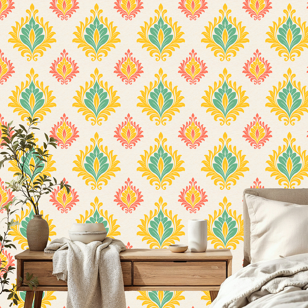
Trending Cerise Color Wallpapers
Explore the best Cerise Color wallpapers for your home. From classic designs to modern patterns


FAQs
What is the meaning of Cerise color?
Cerise represents passion, confidence, energy, and bold self-expression.
Is Cerise a warm or cool color?
Cerise is generally a warm color with vibrant red and pink undertones.
Which colors go best with Cerise?
White, cream, navy blue, emerald green, charcoal grey, gold, and blush pink pair beautifully with cerise.
Is Cerise suitable for small rooms and for big rooms as well?
Yes. In small rooms, it works best as an accent, while in larger rooms it can create a bold and dramatic statement.
Create Your Perfect Space With Cerise Wallpapers
Discover custom-sized, eco-friendly wallpapers in beautiful Cerise tones. Printed with VOC-free inks and backed by a 3-year color warranty.
Shop Cerise wallpaper
Phone Verification
4:59
Home Consultation
For Wallpapers & Blinds
 Material Preview
 Digital Snapshot
 Design Selection

Enter your details to claim this offer: