


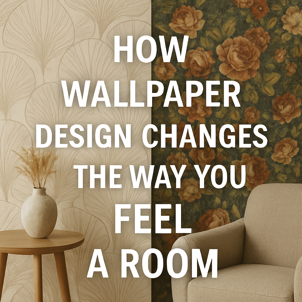
Ever walked into a room and felt like it was cozier than you expected—or surprisingly spacious despite its small size? Believe it or not, part of that impression may come down to the wallpaper on the walls. The way we perceive space is not just about architecture—our brains respond to color, pattern, and light in fascinating ways.
A 2017 study by researchers Yoshida & Sato took this idea to the next level. They explored how different wallpaper patterns and shades affect how spacious or cramped we feel a room is, using controlled miniature models and careful comparisons. Their results are eye-opening for anyone considering wallpaper in a small or oddly shaped room.
Let’s break it down, without any academic jargon—just smart, practical takeaways.
What Did the Researchers Do?
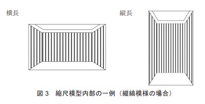
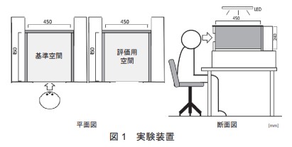
Step: 1
They built two miniature room models at 1:10 scale:
- Horizontal model: wider and shallower
- Vertical model: taller and narrower
Step 2:
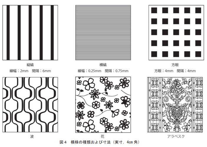
They applied six wallpaper patterns to the walls:
- Vertical stripes
- Horizontal stripes
- Squares
- Waves
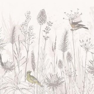
- Floral patterns
- Arabesque designs
Step 3:
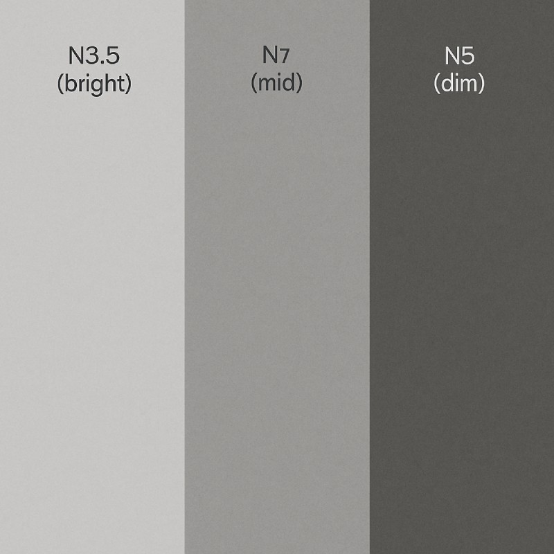
To keep color from influencing perception, all the wallpapers were printed in neutral grey shades at three brightness levels:
- N8.5 (bright),
- N7 (mid), and
- N5 (dim).
Step 4:
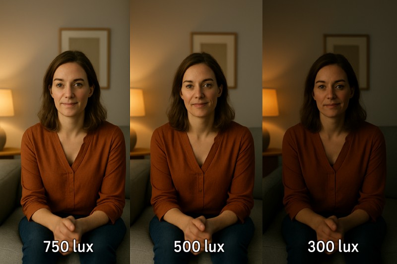
They also varied room lighting: 750, 500, and 300 lux (typical brightness levels you’d see in homes or offices).
Step 5:
Then, 18 people viewed each model through a peephole and judged how spacious, wide, deep, or tall it felt—compared to a blank-wall reference.
Key Findings—And What They Mean for Your Home
1. Patterns Make Rooms Feel Smaller
Surprisingly, just having any wallpaper pattern made rooms feel smaller than if the walls were plain. That doesn’t mean you should avoid wallpaper—but it does suggest choosing carefully based on your space goals.
2. Brightness Is Everything
Brighter wallpapers (like N8.5 light grey) made rooms feel bigger, wider, and deeper. Duller shades shrunk the space visually.
3. Patterns Affect Dimensions Differently
Let’s say you want a room to look wider. Based on the study:
- Horizontal stripes and floral patterns made the horizontal room look wider and deeper.
- Horizontal stripes made both room types feel wider, but reduced the feeling of height.
- Vertical stripes, on the other hand, increased the sense of height, but made rooms feel narrower.

So, each pattern affects the perception of specific dimensions. This means you can choose a wallpaper based on what you want to enhance.
4. Lighting Affects Overall Volume
The brighter the lighting, the larger the room felt—especially in terms of volume. But light didn’t affect how tall or wide the room looked.
Practical Wallpaper Tips Based on the Study
Here’s how you can apply these research-backed insights to your real space:
| Goal | Try This Wallpaper Strategy |
| Make a room feel wider | Use horizontal stripes or floral patterns in light tones |
| Make a ceiling feel taller | Go for vertical stripes in a light shade |
| Add a sense of depth | Opt for floral or horizontal patterns with good lighting |
| Avoid making a room feel cramped | Avoid busy, dark patterns—stick to plain or lightly patterned light-colored walls |
| Enhance overall spaciousness | Combine bright wallpapers + good lighting + simple patterns |
Why This Actually Works
Our brains interpret space using visual cues—line direction, light, and contrast. Vertical lines draw the eye upward (height), while horizontal lines push our gaze side-to-side (width). Lighter tones reflect more light, expanding perceived space, while darker ones absorb it, making things feel closed in.
This means wallpaper can trick the eye into seeing more space where there isn’t any—perfect for small apartments, low-ceiling rooms, or narrow hallways.
Real-Life Example: Tiny Bedroom Makeover
Imagine you have a 10×10 ft bedroom with an 8 ft ceiling that feels boxy. You could:
- Add vertical striped wallpaper in a soft cream tone behind the bed to stretch the height visually.
- Use a light grey or mint floral pattern on the remaining walls to introduce depth without overwhelming.
- Combine with warm lighting at 500–750 lux for a soft, expansive glow.

Explore Striped Wallpaper Designs
Voilà! A space that now feels open, balanced, and restful—without knocking down a single wall.
Final Thought
Yoshida & Sato’s study confirms what many interior designers have long intuited—wallpaper is more than decoration. It shapes how you feel in a space, affecting your sense of comfort, openness, and calm.
Whether you live in a compact studio or want to tweak the proportions of an oddly shaped room, the right wallpaper—chosen with brightness, pattern, and orientation in mind—can visually transform your space. So next time you scroll through wallpaper designs, ask not just “Do I like it?” but “What will this make my room feel like?”
Because good design doesn’t just look good—it feels good too.


 Material Preview
 Digital Snapshot
 Design Selection
